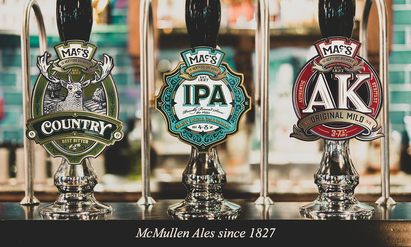


I was asked by McMullen, a family brewer since 1827, to rebrand their collection of Heritage Ales. McMullen had long been affectionately known as Mac's by their loyal consumer base, and now they wanted to make a new sub brand under that name, that would tie together their three Heritage Ales; Country Best Bitter, East India Pale Ale and the famous AK, brewed since 1833.
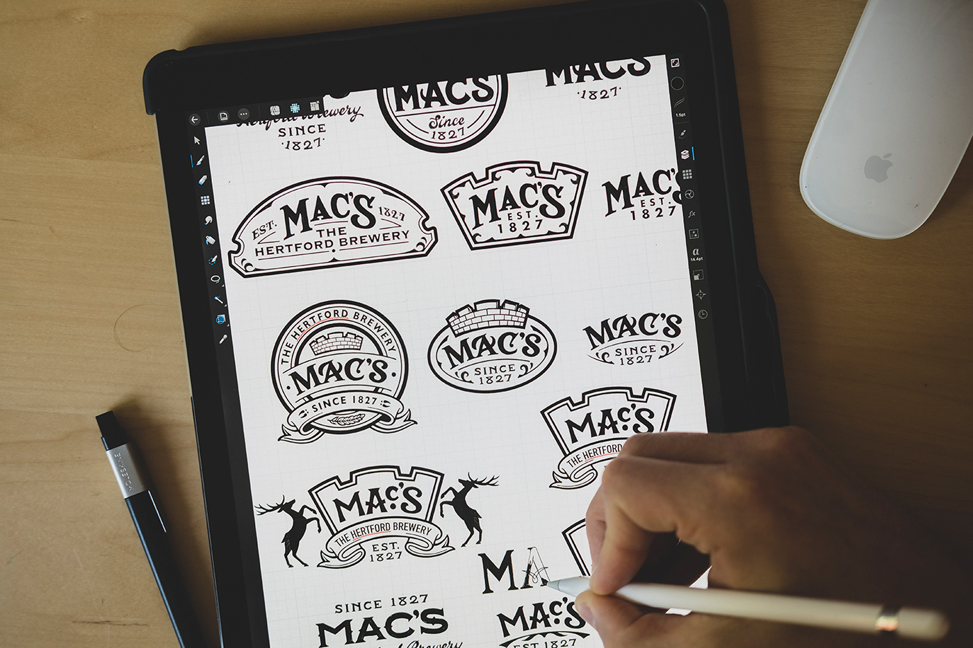
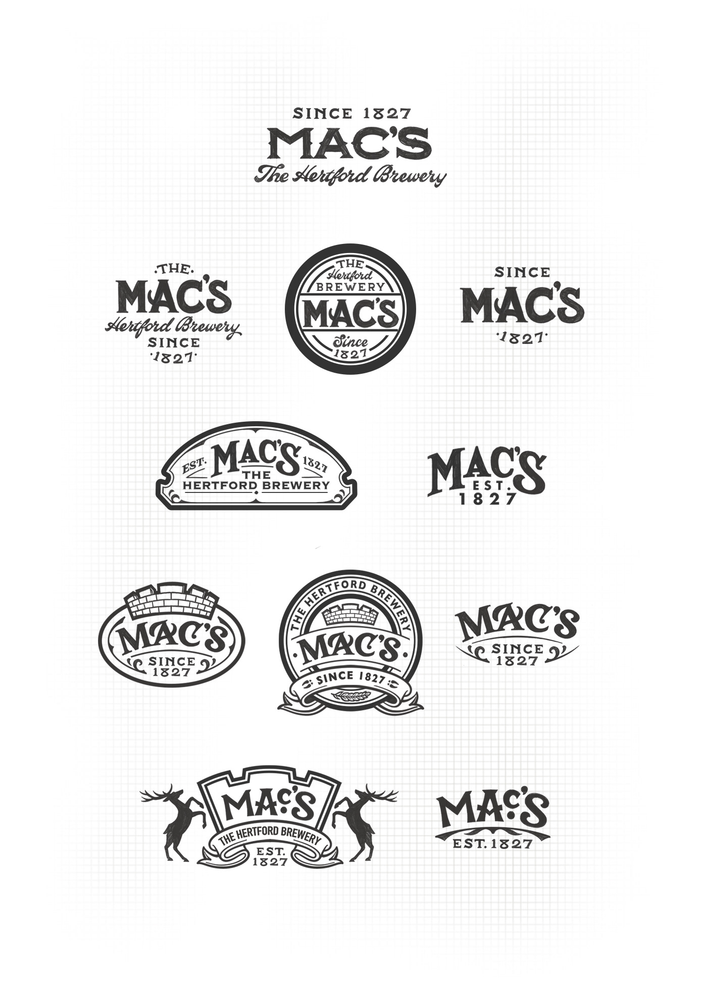
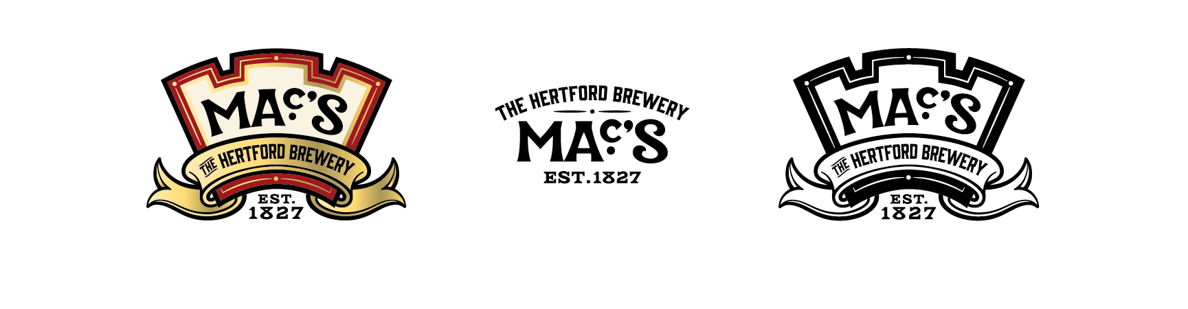
My first job was to create a logo suite for the new Mac's brand. The new Mac's logo had to sit atop each of the new Heritage Ale designs, and McMullen also wanted to pay reference to their provenance and history within the lockup...
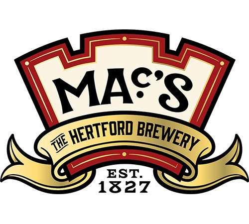
Final Mac's Logo


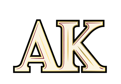
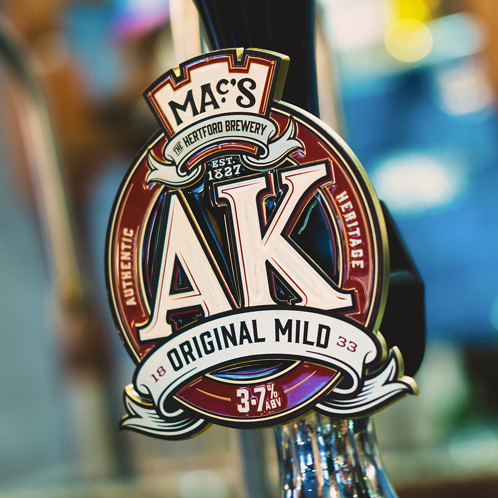
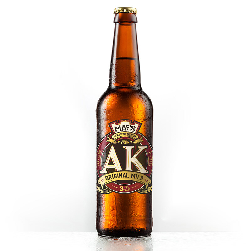
AK ORIGINAL MILD
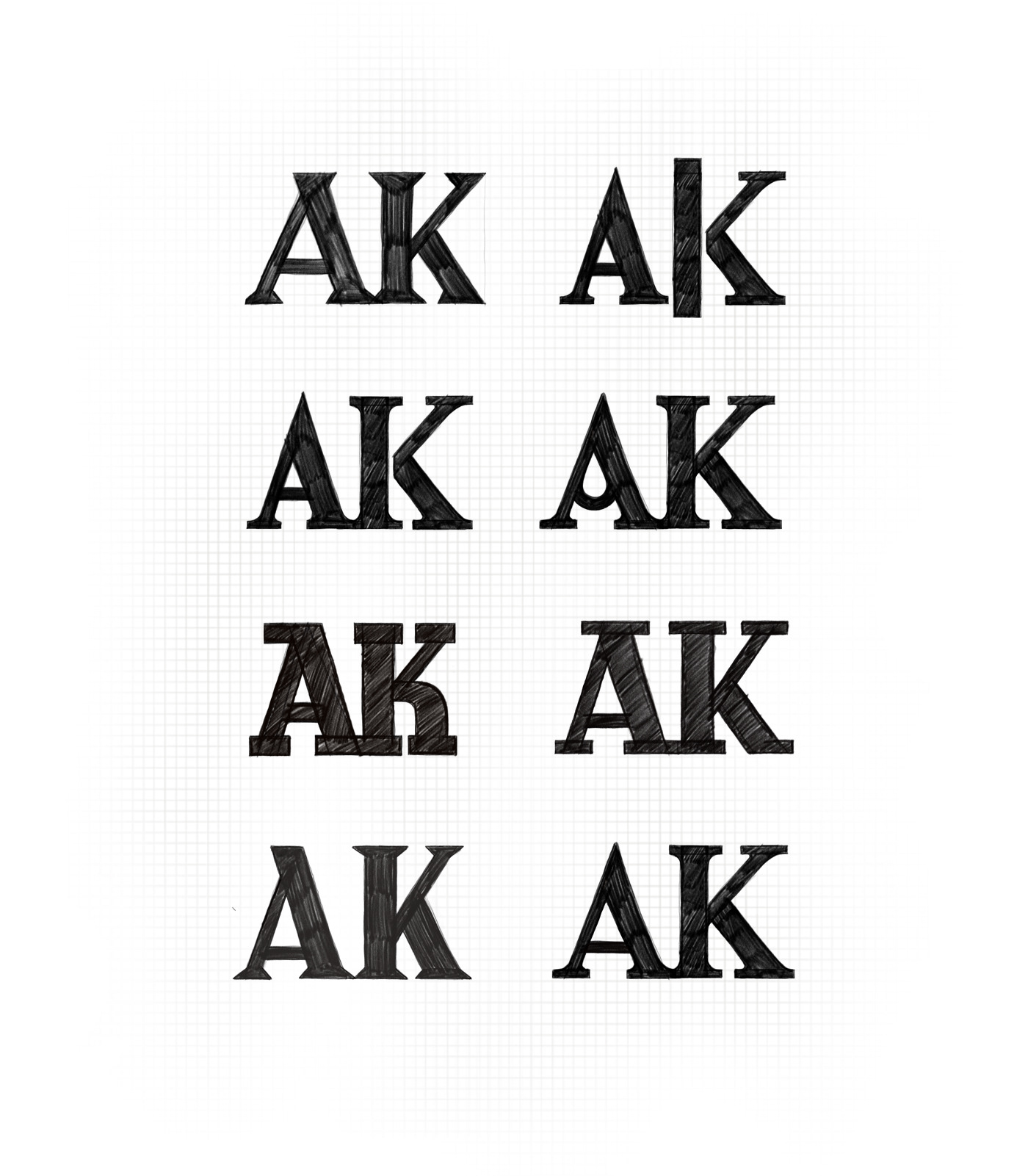
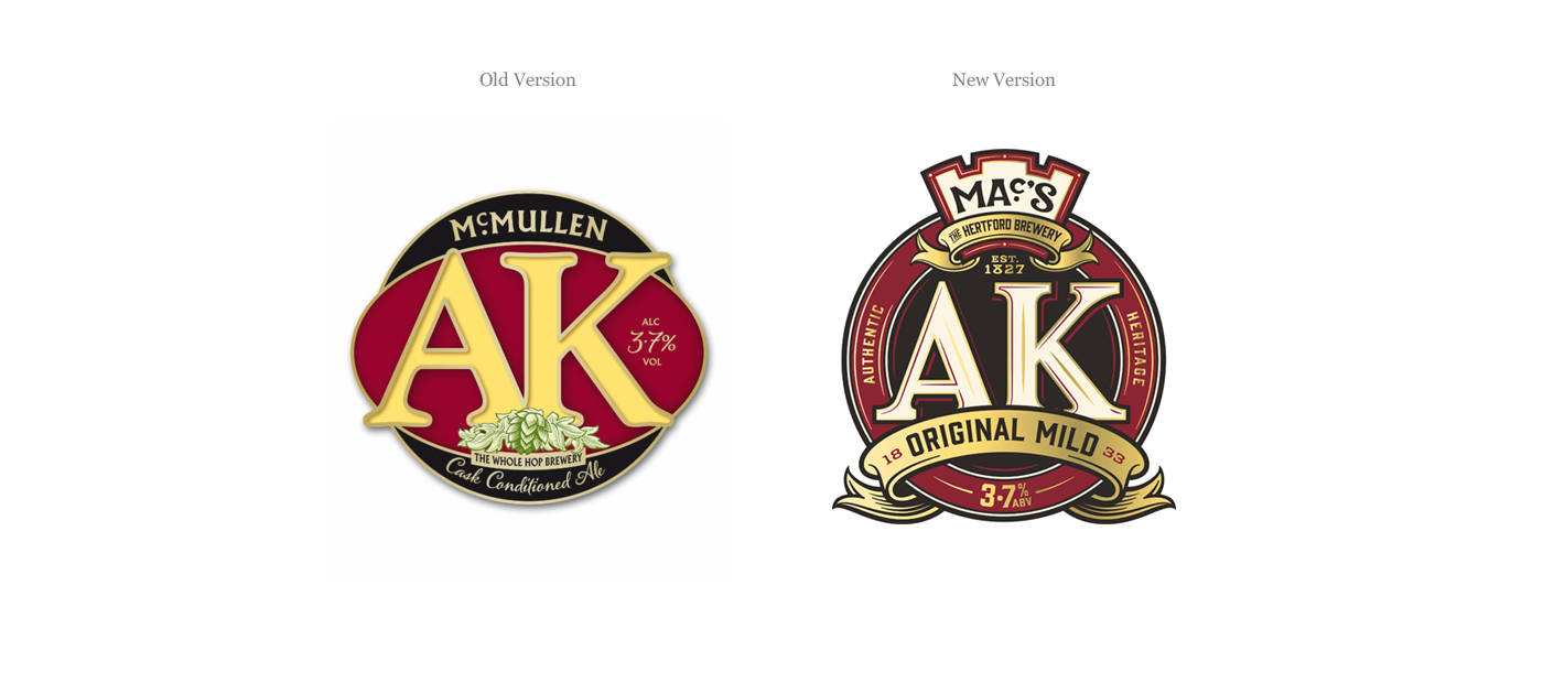
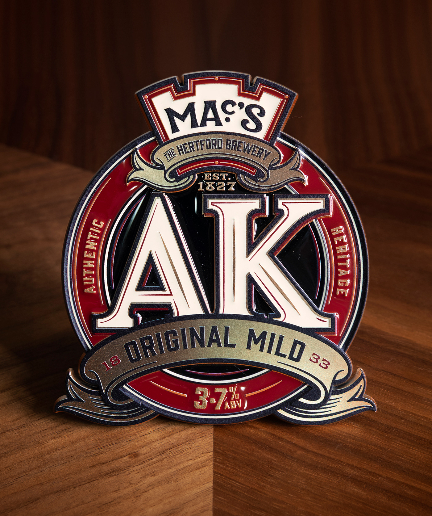
My next job was to make a start on redesigning the logos for each of the Heritage Ales. I started with AK.
AK has been brewed for almost two centuries, and is well known and loved by it's customers, so it was important we didn't stray too far from the colours and existing logotype.
That said, there was a lot of potential for refinement; I re-drew the AK logotype to give it more strength and bring it up to date, whilst still paying reference to it's roots. I also addressed issues with general balance, while bringing it's rich history to the fore through the inclusion of the date on which it was first brewed.

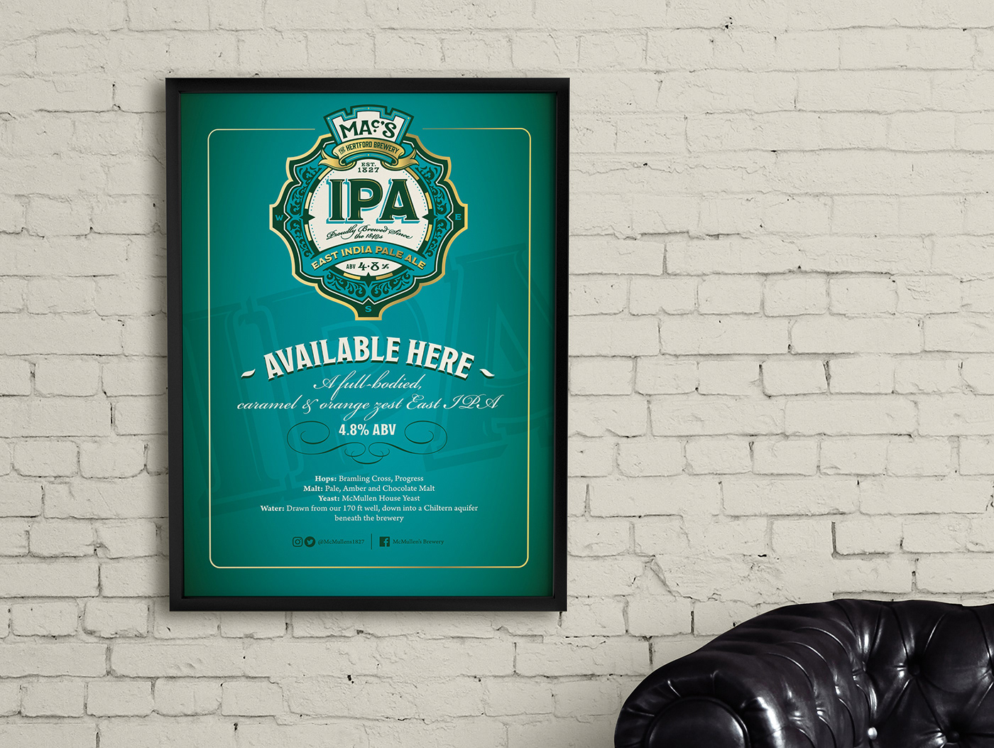
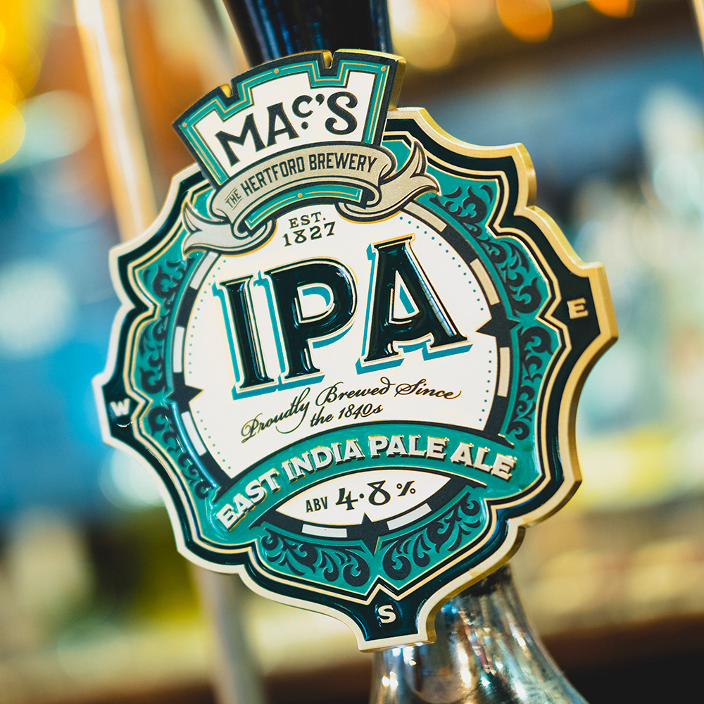
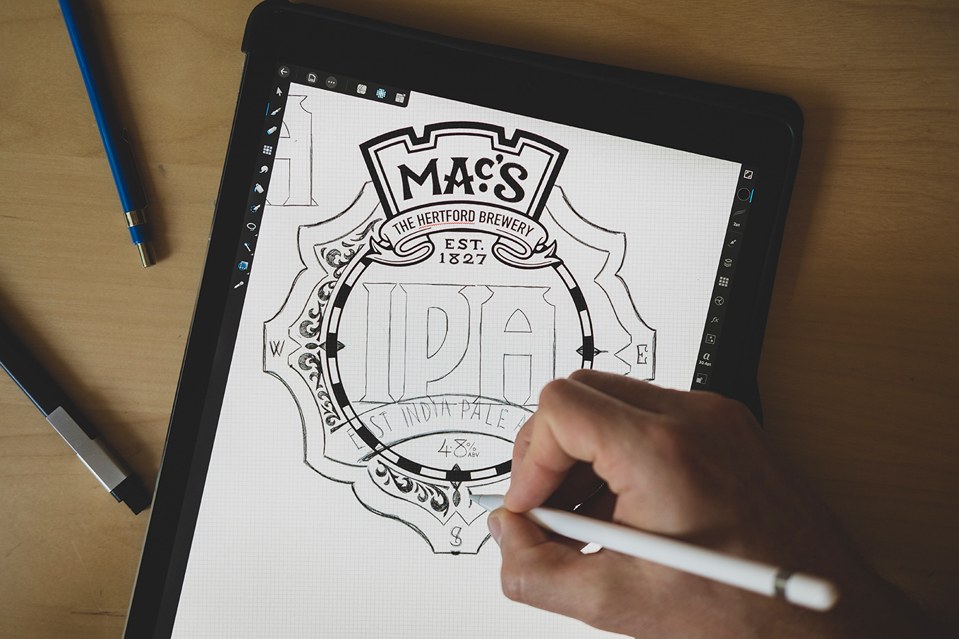
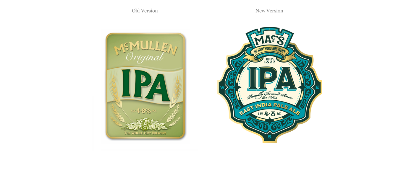
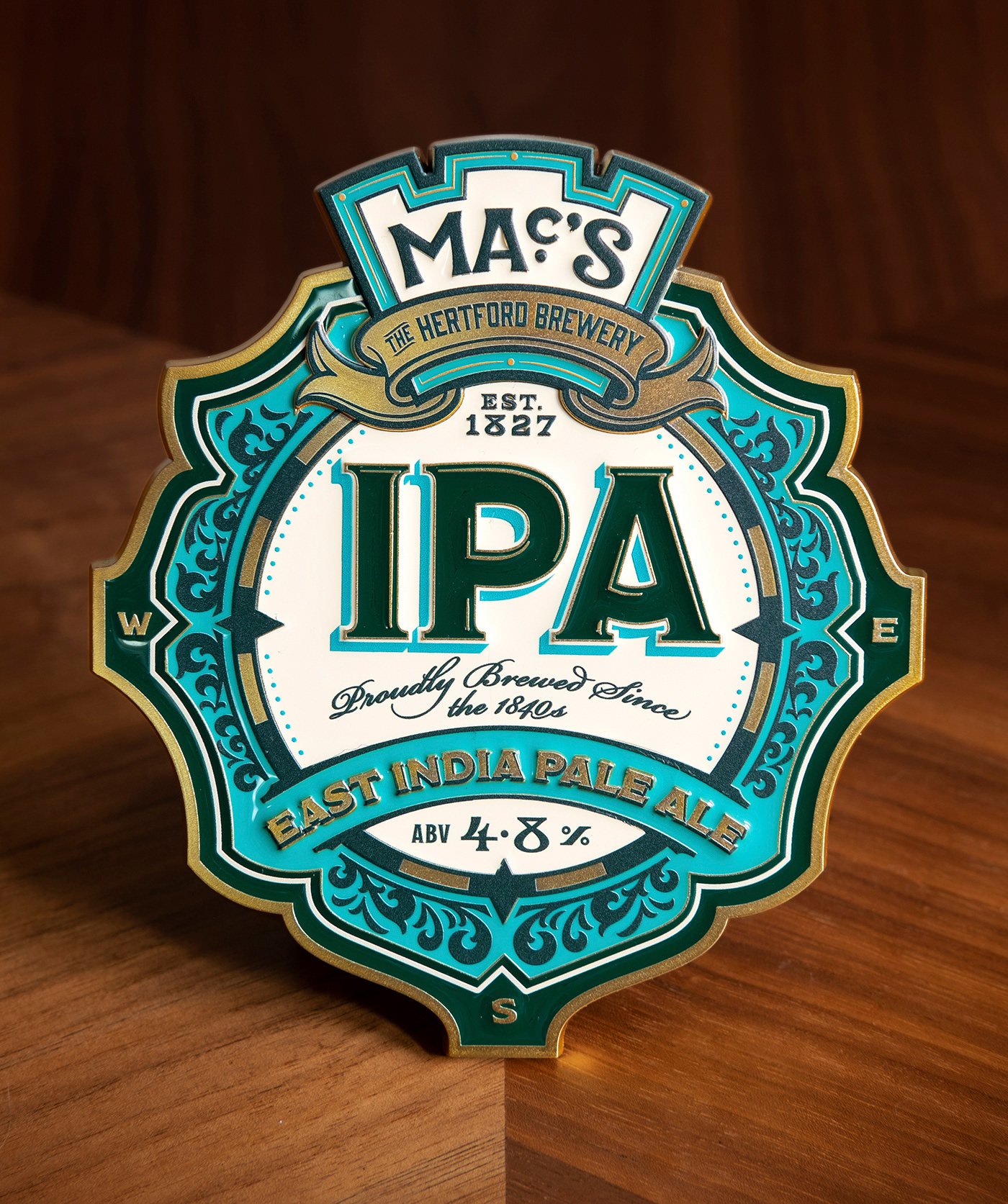
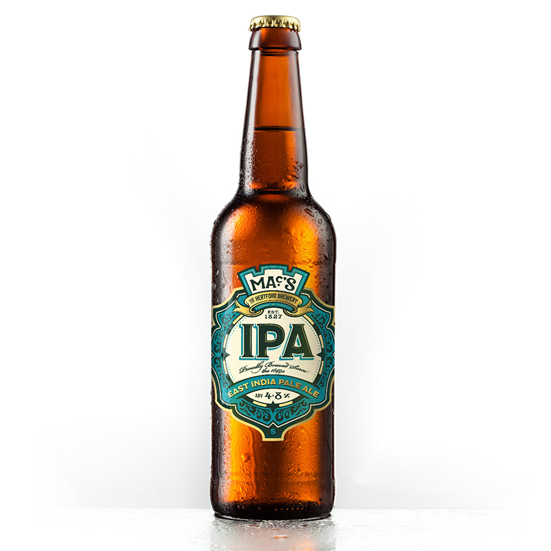
EAST INDIA PALE ALE
McMullen were less concerned with retaining familiarity when it came to redesigning this label. The existing design was fine, but lacked any real personality, so I wanted to introduce a few more points of interest.
Decorative floral ornaments and the colour palette of gold and turquoise hinted at the beer's traditionally exotic links, while the inclusion of the compass points references a well-travelled past; IPA first originated when brewers added more hops to pale ale in order to preserve it on it's long voyage to India.


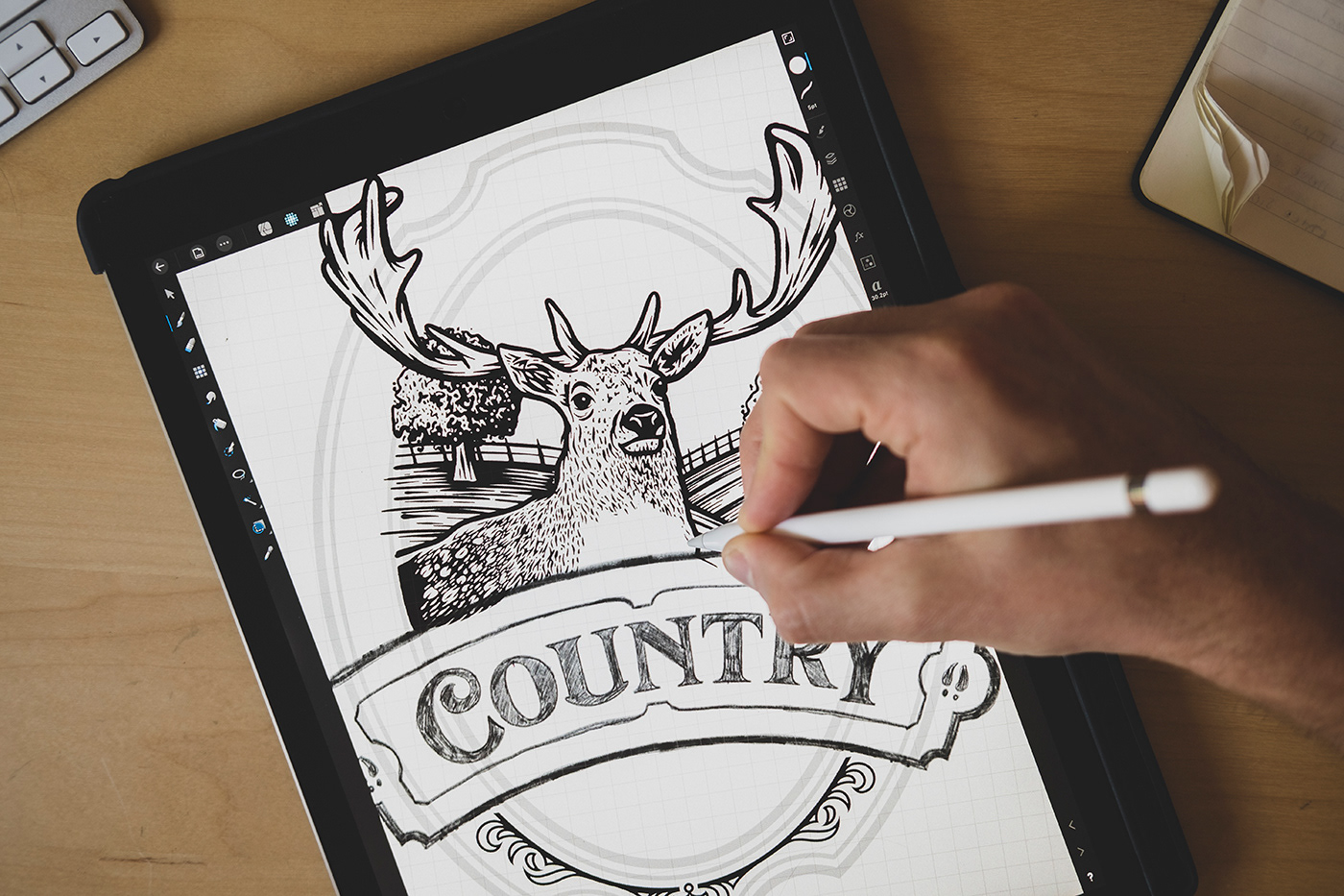
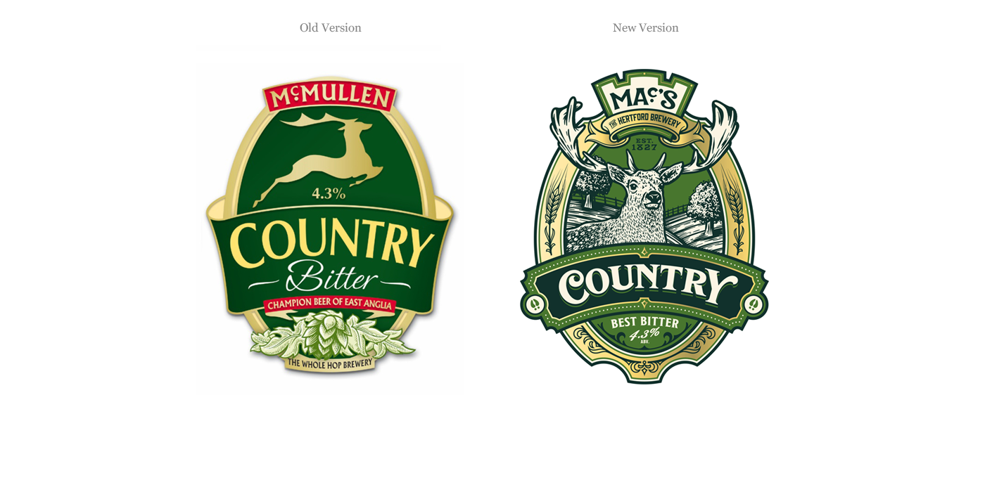
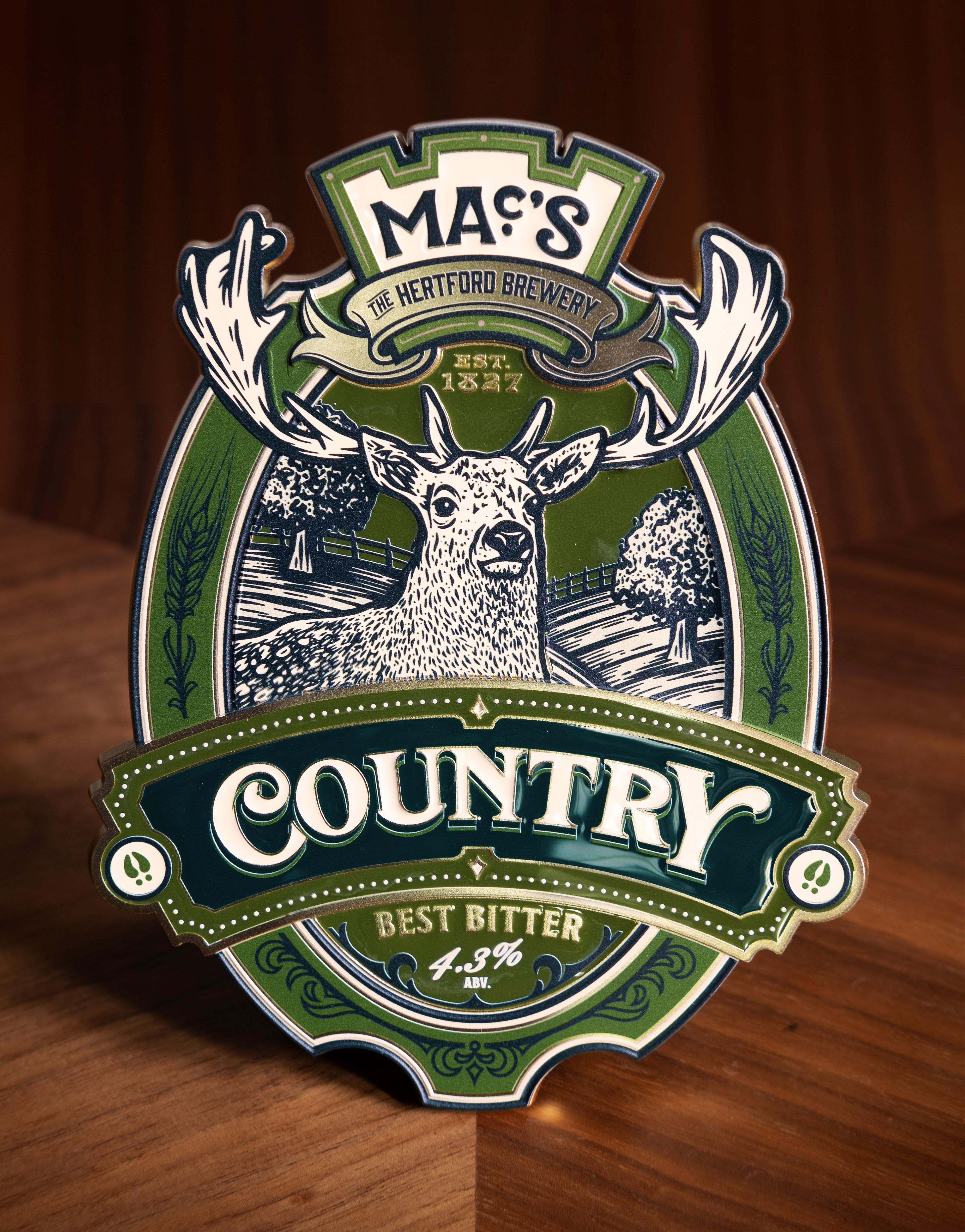
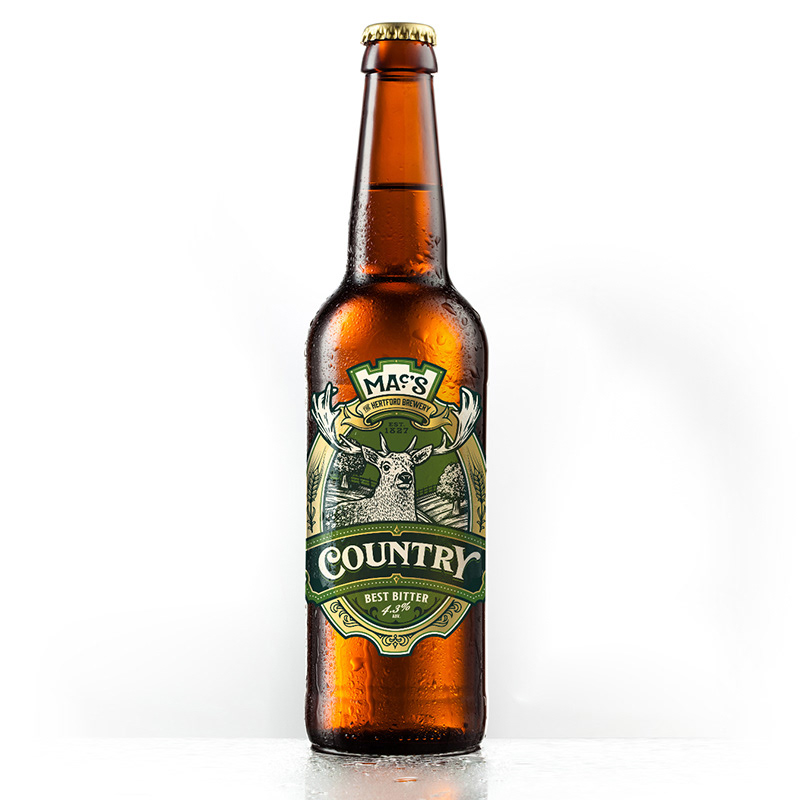
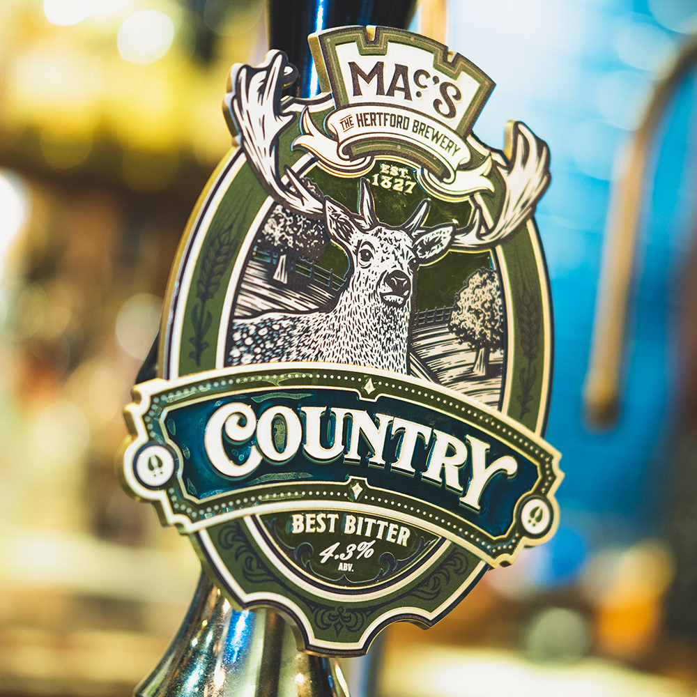
COUNTRY BEST BITTER
The general oval shape and green colour from the old design needed to remain, but other than that I had pretty much free reign with this design.
Based in Hertford, McMullen were keen to pay reference to the Hertfordshire countryside with the main illustrative element, so, given that deer are synonymous with not only Hertfordshire but the McMullen brand (having featured in the main logo for years) we settled on a stag, brought to life in a woodcut illustration style.
I also created bespoke lettering for the main label, as well as some decorative ornaments and barley illustrations within the border to further bring home the countryside feel.